
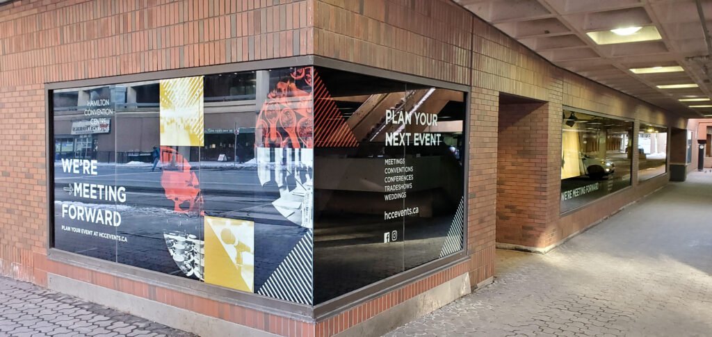
Clear, readable window graphics help businesses communicate essential information before potential customers even step inside. However, small text, poor color contrast, cluttered layouts, and overly complex designs can make storefront messaging difficult to understand from a distance.
These issues reduce visibility, weaken brand recognition, and may cause passersby to overlook important promotions or services. To improve readability, businesses must prioritize strategic typography, strong visual contrast, proper spacing, and a clear information hierarchy.
Well-designed commercial window graphics in Hamilton combine visual appeal with practical communication, helping businesses attract attention without overwhelming viewers. This blog explores key techniques for improving window graphics readability.
Choose Readable Fonts and Appropriate Letter Sizes
Typography plays a crucial role in determining how easily people can read commercial window graphics. Although decorative fonts may look appealing up close, intricate lettering and thin strokes can become difficult to distinguish from across a street or parking lot. Selecting the right typeface and letter size helps businesses communicate essential information quickly.
- Use simple typefaces: Choose clean sans-serif fonts for business names, promotional messages, operating hours, and service descriptions. These fonts generally offer clear letterforms that are easier to recognize from a distance.
- Adjust letter sizes: Increase the size of important text according to the expected viewing distance. Headlines and business names should be more prominent than secondary details.
- Limit font variations: Use one or two complementary typefaces to maintain consistency and prevent visual clutter.
- Prioritize essential messages: Make the business name, primary service, or promotional offer immediately noticeable.
Professional design ensures that every word serves a purpose. When typography is clear and appropriately sized, customers can understand the message at a glance without stopping to examine the window.
Create Strong Color Contrast for Better Visibility
Color contrast helps text and graphics stand out against the window, interior background, and surrounding environment. Even an attractive design can lose its impact when the lettering blends into the scenery behind the glass.
- Combine contrasting colors: Pair dark lettering with light backgrounds or use light text against darker graphic panels to improve legibility.
- Consider changing backgrounds: Account for merchandise, indoor lighting, reflections, and outdoor scenery that may affect how the design appears.
- Maintain brand consistency: Incorporate brand colors strategically without compromising readability.
- Test different lighting conditions: Review the graphic in daylight, shade, and nighttime conditions when the business operates after dark.
Strong contrast creates visual separation, allowing viewers to identify important information more easily. For businesses investing in window graphics Hamilton services, balancing brand aesthetics with practical readability helps create signage that remains noticeable in different environments.
Establish a Clear Visual Hierarchy
A window graphic should guide viewers toward the most important information first. Without a logical hierarchy, customers may struggle to identify the business name, primary service, or promotional offer.
- Highlight the main message: Make the company name, featured service, or special offer the most prominent element.
- Organize supporting details: Position secondary information beneath or beside the headline in a logical sequence.
- Use spacing effectively: Separate text blocks, logos, and images to prevent overcrowding.
- Keep the message concise: Communicate essential information instead of filling the window with lengthy descriptions.
A structured layout allows viewers to scan the design quickly and understand its purpose. By establishing clear priorities, businesses can make their window graphics more informative without overwhelming potential customers.
Use Strategic Placement and Proper Spacing
The placement of window graphics influences how easily pedestrians, drivers, and approaching customers can see and interpret the message. Positioning should account for storefront architecture, viewing distance, and the movement of people around the property.
- Position key messages strategically: Place important text within clear sightlines and at practical viewing heights.
- Allow sufficient spacing: Maintain comfortable gaps between letters, words, and individual design elements.
- Avoid obstructing critical areas: Consider entrances, door handles, display windows, and other architectural features.
- Account for viewing angles: Evaluate the graphic from sidewalks, parking areas, and approaching traffic routes.
Thoughtful placement improves visibility while preserving the storefront’s functionality. Proper spacing also prevents individual elements from merging visually, making the message easier to understand from different positions.
Match the Graphic Material to the Design Objective
The material selected for a window graphic affects its appearance, light transmission, privacy, and overall readability. Choosing the right option ensures that the design performs its intended function without compromising visibility.
- Vinyl lettering: Suitable for business names, operating hours, contact information, and concise service messages.
- Opaque window graphics: Useful for bold promotional displays that require a solid background to support text and imagery.
- Perforated window films: Display printed graphics on the exterior while allowing some outward visibility through small perforations. Actual visibility depends on lighting conditions and the film’s construction.
- Frosted and translucent films: Appropriate for privacy, decorative patterns, and subtle branding while allowing varying degrees of light transmission.
- Static clings: Suitable for temporary promotions and removable window messaging, particularly when businesses frequently update their offers.
Material selection should balance readability, privacy, lighting, durability, and the intended use of the window. An experienced signage provider can help businesses choose materials that support both the design and its practical requirements.
Simplify Graphics and Remove Unnecessary Details
Complex designs can overwhelm viewers, particularly when people are walking or driving past a storefront. A focused composition makes the primary message easier to recognize and helps businesses communicate more effectively.
- Use high-quality logos and relevant imagery: Choose sharp graphics that remain clear when enlarged for window displays.
- Limit competing promotional messages: Focus on one primary message rather than presenting several offers with equal prominence.
- Avoid excessive decorative effects: Minimize unnecessary shadows, intricate patterns, and distracting visual elements.
- Maintain enough open space: Use negative space to separate important information and create a balanced composition.
Businesses considering commercial signage should remember that less is often more. A clean, purposeful design can communicate more effectively than a crowded display. With professionally designed window graphics, Hamilton businesses can present their brand, services, and promotions in a way that captures attention while keeping essential information easy to read.
Test Readability Before Printing and Installation
A design that looks clear on a computer screen may not remain equally readable when installed on a storefront window. Testing the layout before production helps identify potential problems and reduces the likelihood of costly adjustments.
- Preview at different distances: Check whether the primary message remains recognizable from sidewalks, parking areas, and other intended viewing points.
- Inspect full-scale proofs: Evaluate actual lettering sizes, spacing, colors, and overall composition before approving production.
- Review lighting conditions: Look for glare, reflections, and background interference that may reduce legibility.
- Check installation placement: Confirm that the finished graphic aligns with planned sightlines and architectural features.
Professional planning and precise installation help ensure that the final graphic matches the approved design and performs as intended. Testing also allows businesses to make adjustments before the signage is installed.
Conclusion
Readable commercial window graphics combine clear typography, strong color contrast, organized layouts, appropriate materials, and strategic placement. By applying these design principles, businesses can improve storefront visibility, communicate essential information, and maintain a consistent brand presentation.
Cedar Prints helps businesses create window signage solutions that balance visual appeal with practical functionality, whether the goal is to promote services, display operating hours, enhance privacy, or strengthen brand recognition.
For businesses exploring professional signage solutions, careful design and installation can transform ordinary glass into an effective communication tool that attracts attention and makes every message count.