
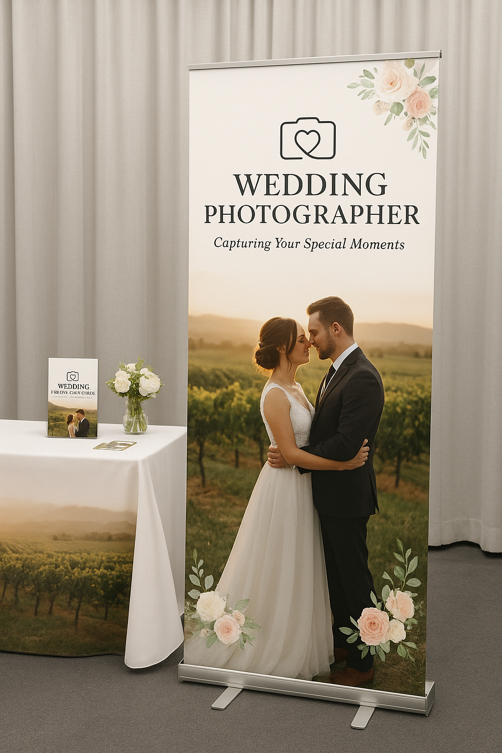
Every trade show has them: booths that are technically “there,” but somehow invisible. Same size, same layout, same forgettable banner, surrounded by dozens of others doing the same thing. The real issue isn’t a lack of effort; it’s a lack of strategy behind the visuals. Height, contrast, messaging hierarchy, and even lighting all quietly determine whether someone’s eyes land on your booth or slide right past it. Once you understand these mechanics, “getting noticed” stops feeling random and starts feeling designed. That’s exactly what this blog dives into, the specific elements that turn an average booth into the one people actually remember.
Visibility Starts Above Eye Level
Trade show visitors rarely walk around looking directly at every booth. Their attention moves across the room, often from one visual point to another. This makes vertical visibility especially important.
A hanging banner positioned above the booth can act like a visual landmark. It allows visitors to identify your business from farther away, even when other displays, people, or furniture partially block the lower section of the booth.
The technical side matters, too. Banner size, viewing distance, placement height, contrast, and lighting all influence how quickly someone can recognize the display. A graphic that looks impressive from six feet away may lose its impact from thirty feet away if the lettering is too small or the design lacks contrast.
Large Graphics Communicate Faster
At a busy exhibition, people do not usually stop to read paragraphs of information. They scan. Within a few seconds, they want to understand who you are, what you offer, and why they should care.
This makes visual hierarchy an important part of booth design. Your business name or logo should be easy to identify, while the main message should be short enough to understand quickly. Supporting information can then guide interested visitors toward products, services, or conversations.
Effective display signs for trade shows use this hierarchy instead of trying to put every possible detail onto one graphic. Think of your booth as a quick visual conversation: the headline gets attention, the supporting message creates interest, and your team takes over from there.
Design Consistency Builds Recognition
A booth can contain several individual elements, but they should still look like they belong together. Backdrops, banners, table covers, signage, and promotional graphics should share consistent branding, including colors, fonts, imagery, and messaging.
This creates a more polished appearance and helps visitors recognize your business across different parts of the booth. Consistency also reduces visual clutter. Instead of looking like a collection of separate promotional materials, the booth feels like one organized brand experience.
For businesses exhibiting at conferences, networking events, community expos, and corporate exhibitions, this consistency can make the entire presentation feel more intentional and professional.
Placement Can Be Just as Important as Design
Even an excellent graphic can underperform when it is positioned poorly. Before choosing display dimensions, consider the booth layout, traffic flow, neighboring exhibitors, ceiling height, entrances, and the typical viewing distance.
A trade show hanging banner can be particularly useful when floor-level displays are likely to be obstructed. Meanwhile, portable banner stands and branded table covers can reinforce the message closer to visitors.
Think in layers. High-level signage helps people locate you. Large backdrops explain your brand visually. Counter-level graphics provide supporting information. Your staff then turns that initial attention into an actual conversation.
Make the Booth Easy to Approach
Visibility gets people looking, but approachability helps turn attention into engagement. A booth that feels overcrowded or difficult to navigate can discourage visitors from stepping inside.
Leave enough open space for people to enter comfortably. Keep important information visible without overwhelming the visitor. Product samples, demonstrations, brochures, or interactive elements should have a logical place within the layout.
A professional display should not only say, “Look at us.” It should also communicate, “Come on in.”
Build for Real-World Event Conditions
Trade show displays need to work beyond the design screen. They may be transported between venues, assembled repeatedly, stored between events, and handled by different members of a team.
That means practical considerations such as portability, setup time, durability, stability, and storage should be part of the planning process. A visually impressive display that takes excessive time to assemble can quickly become frustrating for an event team.
For businesses in Hamilton, Ancaster, Caledonia, Dundas, Burlington, and surrounding communities, professionally designed trade show displays can provide a balance between visual impact and practical usability.
The Bottom Line
A noticeable booth is not created by simply making everything bigger or brighter. It comes from combining visibility, visual hierarchy, consistent branding, strategic placement, and practical design.
When these elements work together, your booth can communicate its identity before a visitor even reaches the space. The right combination of banners, backdrops, signs, and branded accessories creates a clear visual presence that helps your business compete in a crowded exhibition environment.
At Cedar Prints, the goal is to create trade show displays that are professional, easy to transport, simple to set up, and designed to help businesses make their presence count—from the first glance to the final conversation.